Friday, June 19, 2015
Being Critiqued
Yesterday was the RPS advisory session, where a couple of judges took a look at panels of photos from ten aspiring photographers who hope to earn a credential known as "licentiate." We weren't being judged; we were just hearing their opinions about the photos we'd chosen and whether we were ready to submit.
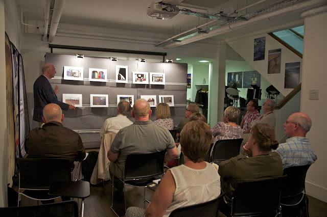
This is how the session looked from my seat near the back row. Yes, those are my pictures up there.
Each photographer was told to bring ten mounted prints and another couple of optional pictures, unmounted. The mounted prints were carefully placed on those narrow shelves, in the order we specified. The goal, as one of the judges said, is not only to have ten good pictures, but also an 11th "image" -- a cohesive panel in which the individual elements relate in some way to each other.
Mine were viewed in the afternoon almost at the end of the day. I was completely calm until they actually started to go up -- then I had a momentary panic attack. My heart was pounding. I was so surprised to have that adrenaline rush!
Overall, I fared pretty well. One of the judges began by making largely positive or neutral comments about each photo, and then both offered some criticism. For example, they suggested I remove this picture -- in which they felt the figure of the skateboarder got somewhat lost in the overall composition -- and replace it with this picture, which they thought relates well to this one. I agree -- they're absolutely right.
They also made some suggestions for minor tweaks to a couple of other images, which are easily achievable in Photoshop. (Once I learn how to use Photoshop -- ha!)
The suggestion with which I completely disagree involved this picture. One judge in particular felt there's too much black space, that the sliver of sky is unnecessary and that the image should be radically cropped, taking about half off the top and a slice off the left side, leaving just the man walking through the shaft of light. I think that would reduce it too far -- I would argue that the blue of the sky is an essential color component in the overall composition, and the immense arch of the bridge both conveys the hugeness of the structure and echoes the curving shaft of light. (I didn't argue the point there, because I wasn't sure it was really my place -- I was there to hear their suggestions.)
But anyway, that's a suggestion that I probably will not take. If my panel fails because of that one image, then so be it. At some point you have to remain true to your own eye, you know?
I believe the next formal judging doesn't happen until fall, so I now have some time to make those changes and get the panel in shape for submission. It was a very interesting day, being able to see everyone else's work, seeing what caught the judges' eyes -- and what didn't!
Subscribe to:
Post Comments (Atom)

I totally agree with you on that last photo. It's a much more dramatic and towering image the way you cropped it. You absolutely need the blue sky, the shadowed arc of the bridge. It's a perfect photo as it is. Judging is so subjective. Glad you're being true to your own eye!
ReplyDeleteI like that last photo, too! I hope you find this worthwhile...
ReplyDeleteThanks for explaining the advisory procedure - I agree with the suggestion about taking out the flag fence but strongly disagree about cropping the blue sky out. Cropping it would reduce it to a man walking along in a patch of light. Maybe it was the angle of the sky that bothered the advisory person.
ReplyDeleteHowever it is sometimes beneficial to see your photographs through the eyes of some-one else.
Ms Soup
What a nail biting situation, to sit and have your photos critiqued right in front of you. Yikes.
ReplyDeleteI love the photo just as is. I tried cropping it and ended up with what looked like a man walking inside a witch's hat! Interesting in itself but it definitely doesn't work for me. :)
I have to agree with you and those above. I don't think that last photo would have as much impact if it were cropped down to just the man and shaft of light. It has much more drama this way. I like that photo with the flag fence, especially the way you waited for the guy with the skateboard to be right in the center of the cross. However, I do agree with their decision that the other two photos play off of each other very well.
ReplyDeleteI don't claim to have any eye when it comes to photography but I agree with you on the shaft of light picture. For sure. It's that blue sky curve that makes it so interesting.
ReplyDeleteYou are so brave!
I recall really liking that last photo when I originally saw it. I agree with the other correspondents and yourself that you should leave it as is
ReplyDeleteGood luck with the whole judging process! I was surprised to hear they recommend photoshop - I'm such a naive person sometimes. I didn't think that would be allowed. I have been going through a tough cycle of exams at music school and I completely sympathise with you. It's hard being judged when you're being creative. Partly you don't want to be judged on what you ARE, and partly it's just all so subjective. Good luck!
ReplyDeleteI totally agree about that last photo - the blue sky is what makes it interesting!
ReplyDelete